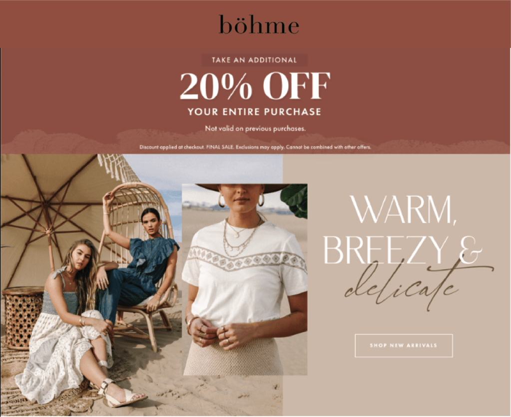
Hello all! I want to discuss a campaign ad and walk you through how to create an ad that falls into a specific ad campaign. This will include how to get the ad to have a similar look and feel without replicating the first ad and changing just a few things. This can be very useful if you have a client comes to you with a request to create a series of ads or for you to take an original ad idea and asks you to create a series of ads off of it. In the above images, there is an example of an original ad that I was given and asked to create another ad that was similar if it were to be in an ad campaign. The one to the left is the original ad and the one to the right is the ad that I created.
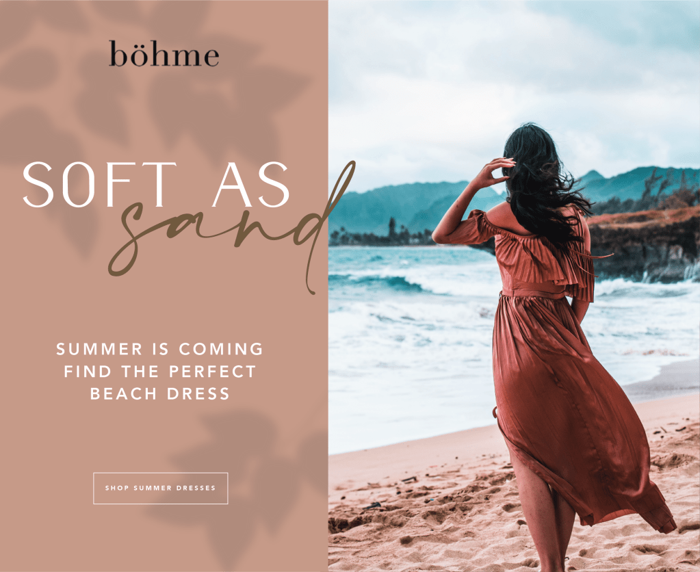
Original Ad

Contrast
Let’s first pick apart the first ad to see how they accomplish (or don’t accomplish) successful design elements and how we can use the same principles in the ad that we are going to create to give it the same look and feel. First let’s look at contrast (blue on draw over). If you look at the brown and white text on top of the sand background, there is enough contrast to be able to read the text. There is also contrast with how they have a large picture and a small picture layered on top as well as contrast with smaller and larger type. This give the piece texture and keeps it from feeling stagnant and stale.
Color
Another important design aspect that this ad uses is color (yellow on the draw over). In the original ad we see that the color scheme they choose is monochromatic meaning that the colors come from the same color family on the color wheel with using the terra-cotta, sand, and brown colors. However they still have the right amount of contrast, as discussed above.
Typography
Another design element that used was typography (green on the draw over). Again, as mentioned they have a nice use of scale with the text to lead your eye through the ad. They also pair a modern serif font and a script font to create texture and variety as well.
New Ad
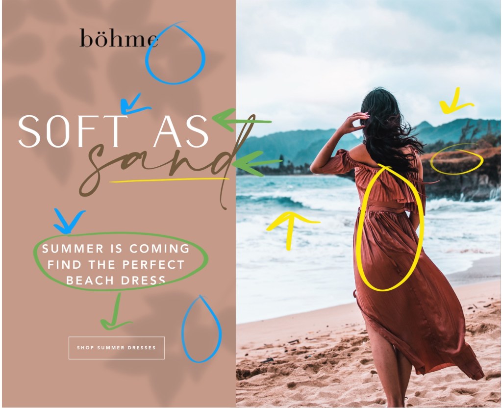
Contrast
In this new ad I tried to use contrast (blue in draw over) in a lot of the same ways as the original ad. I choose to use white text on a colored background. I also used a leaf shadow overlay with just enough contrast to stand out.
Color
I stuck with the same monochromatic color scheme (yellow in draw over), except I used a different background color that had a little more red in it than the original ad. I did this because I wanted it to have the same feel but not the exact same look. I also choose a picture that had the terra-cotta color from the original ad (the dress), but also some other colors that complemented the red. The photo has a very blue color which is analogous with the reds in the ad.
Typography
For typography (green in draw over) I stuck with similar typefaces by using a modern serif that was as close to the original ad that I could find. I also used a brown script font that looked hand written and had the same x-heigh and flourishes as was used in the original ad. I also used the same sans serif font in the original ad for the body and the button.
Conclusion
I hope that as we went through these design principles it helped you to see the differences and similarities between the ads. The purpose was to show how you can use the same design elements to create unity through different designs without replicating the exact layout. I encourage you, even if it just for fun, to put these principles to use and try creating your own secondary ad to an original ad that you like!
