What Makes Good Design?
Have you ever looked at something and wondered why it looked SO good…or bad? Good design is abundant, but bad design is also running rampant out there. This blog will go over some elements that make up good design so that next time you look at something and it either gives you the warm and fuzzies or it makes you feel like you want to run in the opposite direction, you will know why.
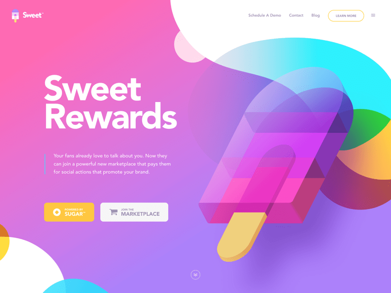
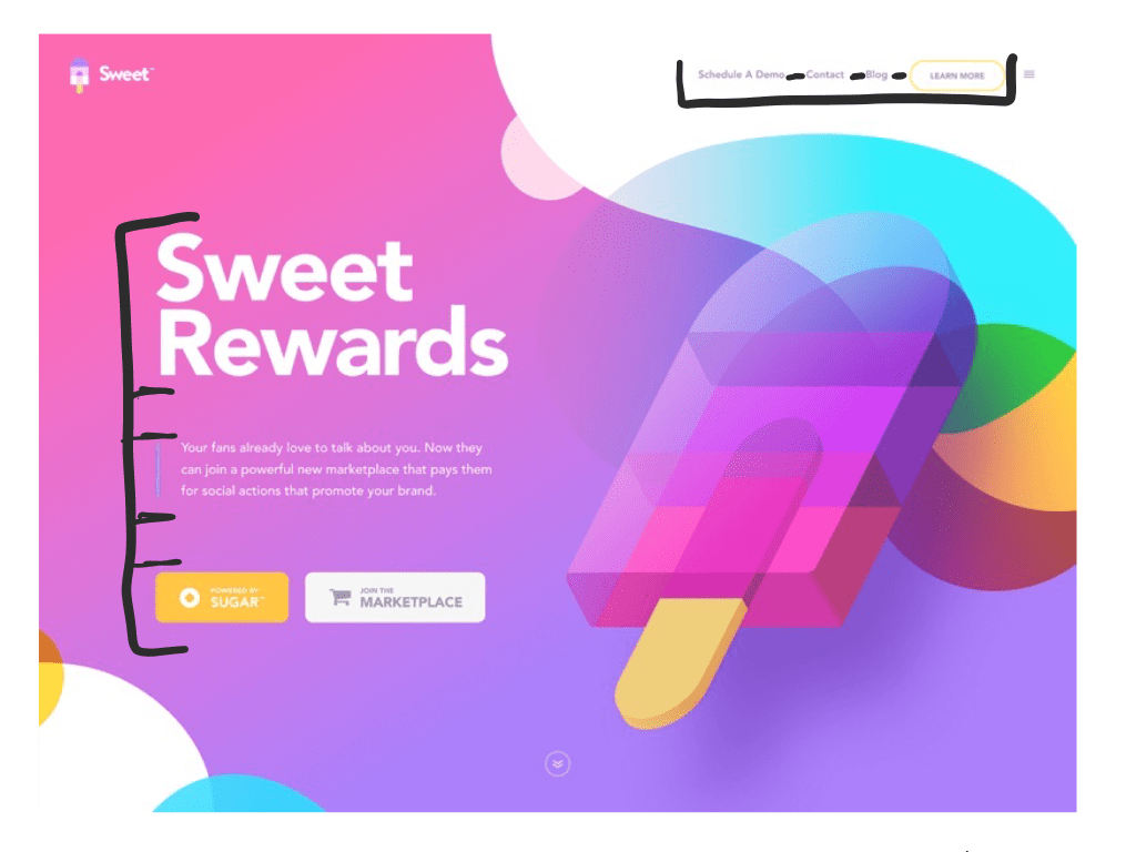
For the purpose of showcasing good design, I’ll be using this website hero banner created by Eddie Lobanovskiy as an example. We will be breaking it down by these following elements: contrast, repetition, alginment, proximity, and color.
Contrast
In this hero banner image, there are a lot of uses of contrast which means that there are elements that are drastically different from one another (in the form of color, shape, etc.) in order to complement one another.
If you look, there is nothing that is blending into the background that shouldn’t be (the artist uses a nice gradient effect which is good, but we will talk more about that in the color section). Look at the title, “Sweet Rewards”. It is in white, along with the body text, which contrasts very nicely with the background making it legible to read. Legibility and functionality is just as important, if not more, than appealing design is, especially when it comes to websites.
Another use of contrast that is shown here is the blocky, sharper looking shapes compared to the soft, fluid shapes. If you look at the popsicle graphic, it as a more blocky feel. However, if you look at the background and the surrounding shapes, they are more fluid such as the round bubbles and edges of the gradient background. Even the buttons have rounded corners to create that contrast.
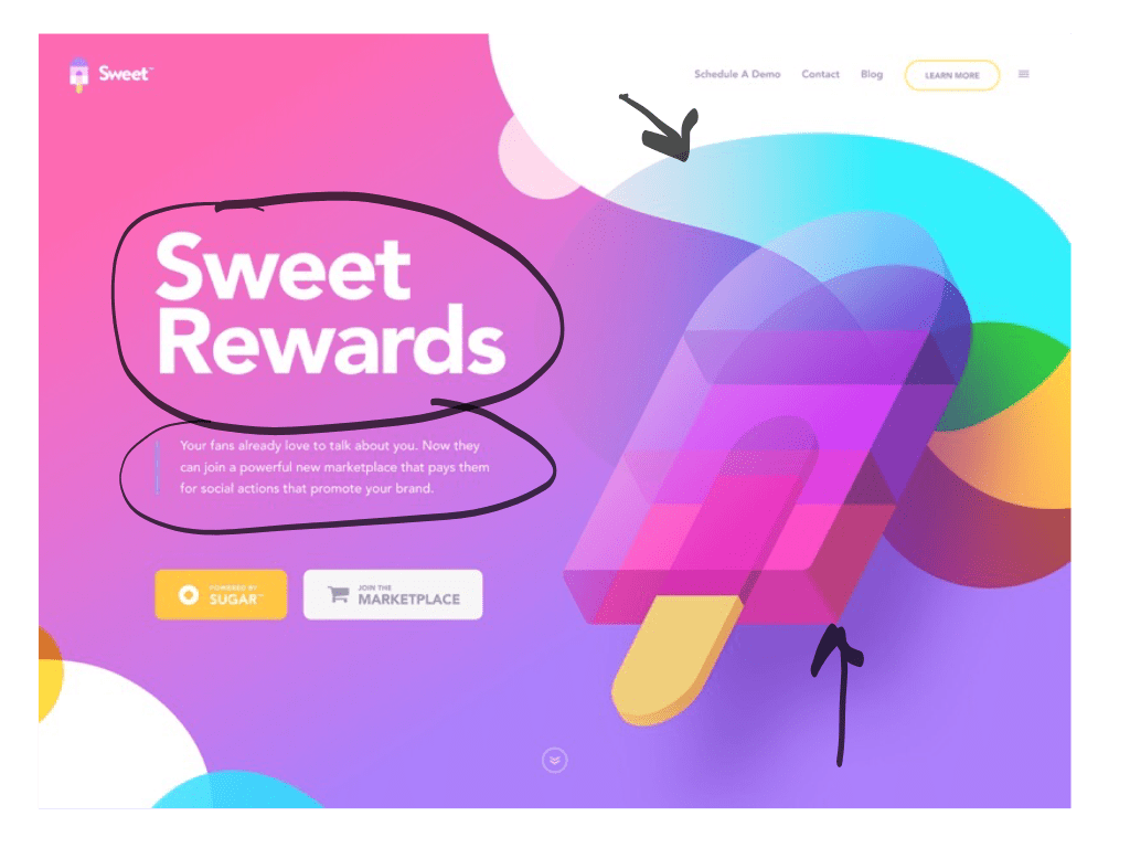
Repetition
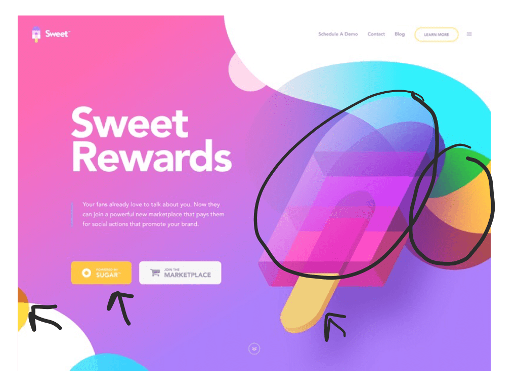
Another important design element is repetition. Repetition is the use of repeating an element in order to create unity throughout the piece. In our example, one way you can see the use of repetition through the round shapes. They are repeated multiple times in the background both in the bottom left corner and the top right corner so that your eye moves all throughout the image instead of just getting stuck in one spot, or worse, wandering off of the image and moving on to something else.
Another way we see repetition is through the colors. There is a repetition of the pink, purple, and blue colors. Although they are used in different ways, they create a very nice cohesive look throughout the image.
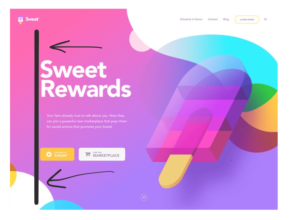
Alignment
Alignment is also really important for a successful design. In our example, notice how all of text has a left alignment. It is important to keep it consistent so that the design feels unified and not hectic. Even though the text within the buttons are centered, the buttons themselves are left aligned so it works. Imagine if the title was left aligned, the body was centered, and the buttons were over on the right. It just would create chaos and most likely make the viewer feel uncomfortable.
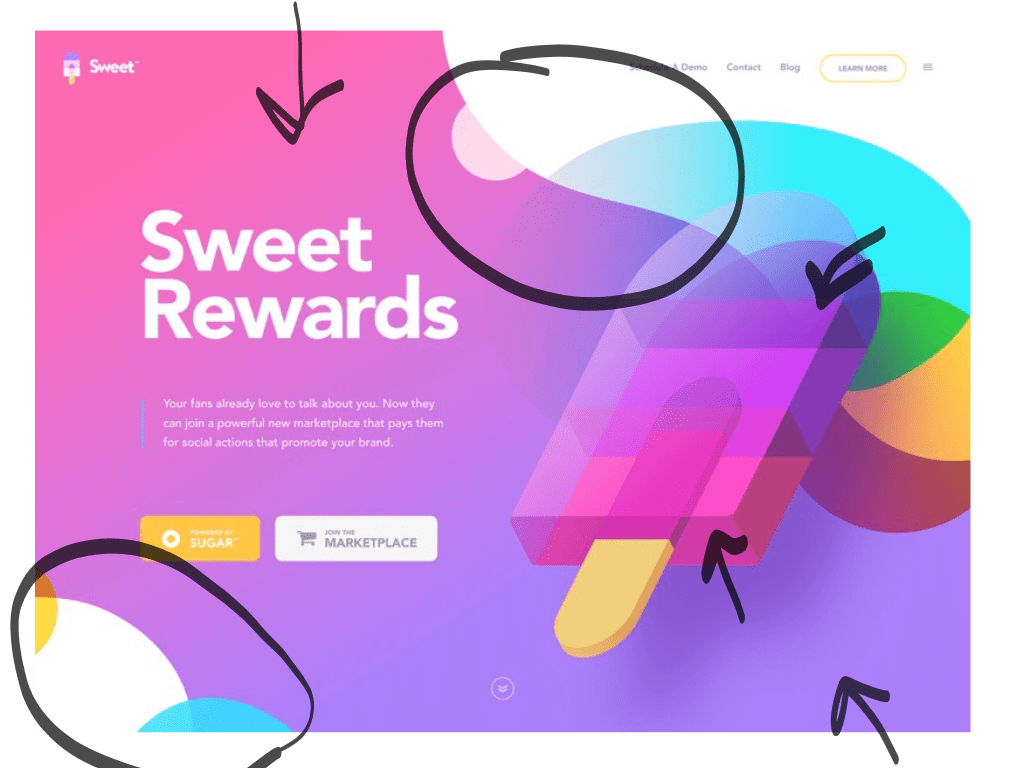
Proximity
Have you ever looked at something and it just felt way too far away from where it belonged or out of place? Well, that is because the designer didn’t do a great job at using proximity. However, in this example you can see a good use of proximity by the related items being close together. For example, the navigation at the top right has good proximity between the links. You can tell that is the navigation area. The title, body text, and buttons all are a good proximity to each other. It leads your eye from the title, to more details, and finally some options to click on to navigate you through the site.
Color
Lastly, color is another important element of design. A poor color palette and leave a piece looking dull, off, or just all around bad. Here, the artist is using mostly an analogous color scheme which means that he is using colors that are next to each other on a color wheel. You can also see this analogous scheme in the green, yelp, and red that he used in the background. However he is also using complementary colors with the pops of yellow he uses to contrast with the blues.
In Conclusion…
Hopefully through each of these examples of good design principles you will be able to see the importance of contrast, repetition, alignment, proximity, and color. Without the use (or the misuse of) these element of design will leave a piece feeling…off. These elements can apply to any art form whether that is painting, sculpture, or graphic design! We’ve all experienced it, whether it is something we have made ourselves or something we are viewing. Now you will be able to know what does and what does not makeup a beautifully designed piece.
